- Bar charts
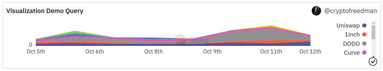
- Area charts
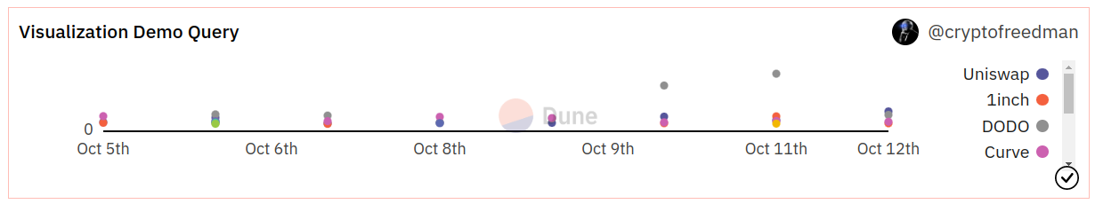
- Scatter charts
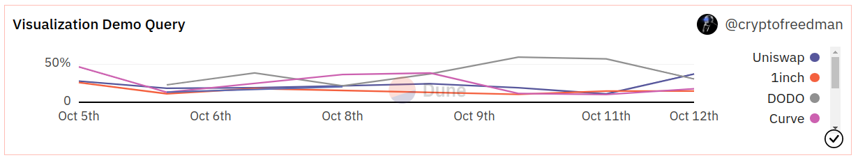
- Line charts
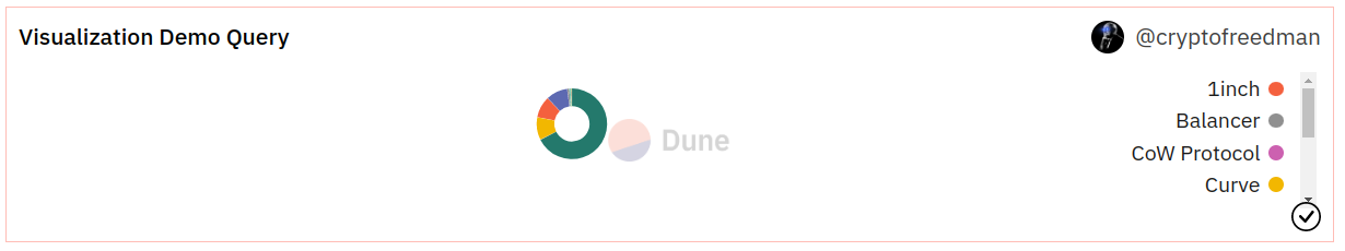
- Pie charts
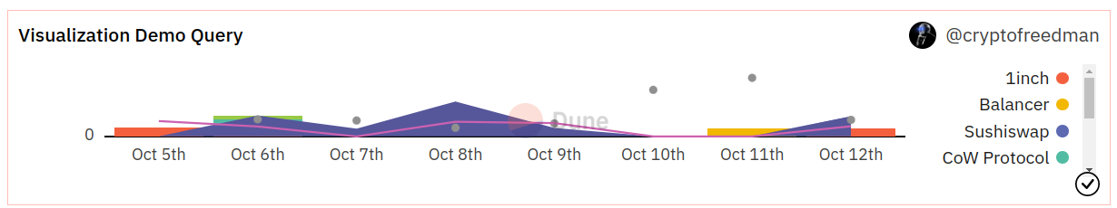
- Mixed graph


Visualization Configuration Options
- Chart options
- Result data
- X-axis options
- Y-axis options
- Series options
- Pie options
This section allows you to define how to display your data. Title
Title
Title- The title will appear in all instances of this graph prominently at the top.
- The graph will always keep the name of the Query, even if you edit this.
- Ticking this box will enable or disable the legend for the chart.
- If applicable, ticking this box will stack the chart values on top of each other based on the x-axis values.
- If this is not turned on, the values will be plotted individually on the y-axis.
- The calculation underpinning this will always group the value corresponding to one value on the x-axis. Make sure your data is clean in able for this to work (avoid gaps in your data).
- This will normalize the chart to display percentage values of the chosen data table.
- The calculation underpinning this will always group the value corresponding to one value on the x-axis. Make sure your data is clean in able for this to work (avoid gaps in your data).
- Ticking this box leads to the display of the individual datapoints inside of the graph.
- This only makes sense in cases where you have few datapoints that are spread out far enough from each other to not overlap.


X/Y-axis Tick and Label formats
 Tick formats change how numeric values and axis labels in your graphs are displayed.
Here’s how to format them:
Tick formats change how numeric values and axis labels in your graphs are displayed.
Here’s how to format them:
| Starting Value | Tick/Label format | Output | Description |
|---|---|---|---|
| 1256784.3745 | [blank] | 1256784.3745000 | Displays the number 7 decimal precision. |
| 1256784.3745 | 0 | 1256784 | Displays only the integer. |
| 1256784.3745 | 0,0 | 1,256,784 | Only displays the integer with comma separation. |
| 1256784.3745 | 0,0.00 | 1,256,784.38 | Displays the number with [x] decimal precision, where [x] is the number of 0 you add after the decimal point. |
| 1256784.3745 | 0.0a | 1.2M | Displays the number with [x] precision and a letter based on the number’s 1e[y] power (eg “m” for million, “b” for billion) |
| 1256784.3745 | $0.0a | $1.2M | Adds a ”$” to the number. Works with all formats above though use of the a suffix is recommended. Currently the only ”$” is the only supported currency symbol. |